Smoke overhead and smoke in your lungs aren’t the same thing, and the Oregon smoke map shows both on one screen. That’s how a gray plume can blanket Eugene on the map while the monitor a mile from your front door still reads green. Search “smoke map Oregon” on a hazy August morning and that contradiction is usually the first thing you see.
Each layer answers its own question. Colored dots report what monitors on the ground are measuring right now, gray shading marks smoke a satellite spotted from above, and fire icons mark where something is burning, give or take a kilometer. Read them together and you get today’s air plus a preview of tomorrow’s.
I put this guide together for anyone in Oregon who checks the air before letting the kids or the dog outside. It also covers one attic fix that keeps more smoke outdoors where it belongs.
TL;DR Quick Answers
smoke map oregon
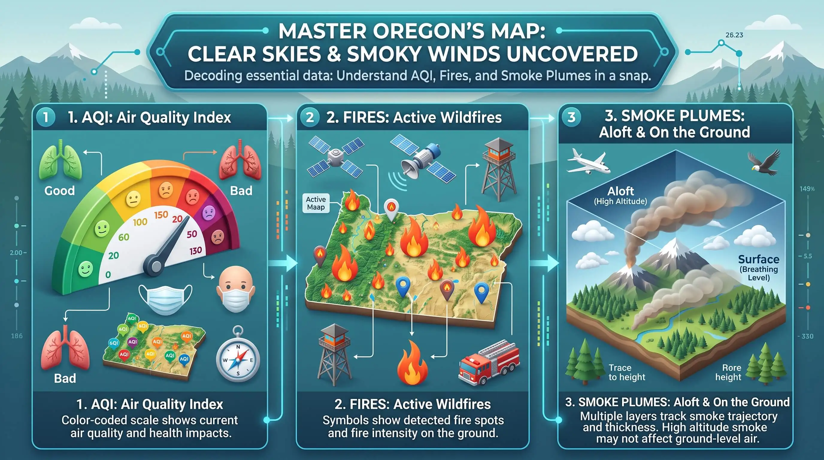
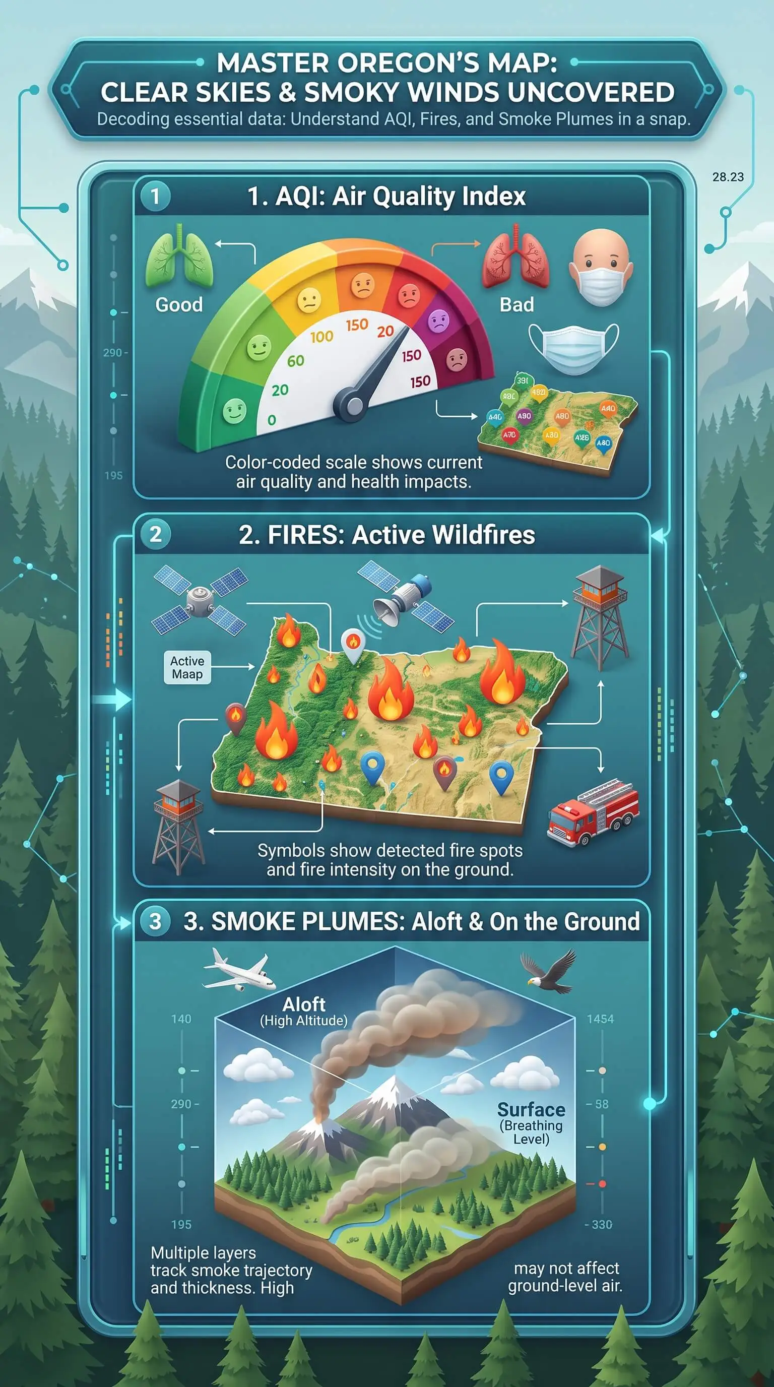
An Oregon smoke map stacks three layers, and each answers a different question. Colored AQI icons show the fine-particle smoke you're breathing at ground level right now. Gray plumes show smoke satellites seen from above, which may still be overhead. Fire icons mark where something is burning, give or take a kilometer.
Trust the nearest AQI reading first. It reflects the air around your home and should drive today's plans.
Check the number type. On the Oregon Smoke Information Blog map, clicking an icon shows a PM2.5 concentration, not an AQI value.
Mind the plume timing. NOAA maps smoke from daytime satellite imagery only, updating around 8 to 9 a.m. and 4 to 5 p.m. Pacific.
Confirm advisories with the state. Oregon DEQ and the free OregonAIR app report readings from state monitors.
Seal the attic before fire season. Gaps in the attic floor let the stack effect pull smoke indoors.
Top Takeaways
• Trust the ground reading first. The AQI icon nearest you reflects the air you’re breathing right now.
• Treat plumes as an early warning. Satellite smoke may sit high overhead and mix down later.
• Read fire points as approximate. A satellite detection can land more than a kilometer from the actual flames.
• Match the numbers before comparing them. A PM2.5 concentration and an AQI value measure different things.
• Seal the attic before the season. Air sealing cuts the stack effect that pulls smoke indoors.
The Three Layers on Every Oregon Smoke Map
EPA and the U.S. Forest Service run the AirNow Fire and Smoke Map, and most Oregon smoke maps follow its lead by stacking three kinds of data on one screen. Pull up a live Oregon wildfire and smoke map in another tab to follow along.
The AQI Layer Shows What You Are Breathing
The colored icons are ground-level readings of PM2.5, the fine particles that make up most wildfire smoke and slip right past your eyes. Permanent monitors, temporary smoke monitors, and low-cost sensors all feed this layer. Before sensor data reaches the map, EPA cleans it and runs it through a correction equation so it tracks closer to regulatory monitors. Tap any icon and you’ll see whether conditions are getting better or worse.
The Smoke Plume Layer Shows What Is Overhead
The gray shading comes from the NOAA Hazard Mapping System, where analysts outline smoke on daytime satellite images and rate it light, medium, or heavy. The satellite looks straight down through the whole sky, though. So a plume on the map can’t tell you whether that smoke sits at rooftop height or far overhead.
The Fire Layer Shows Where Smoke Starts
You’ll see two kinds of fire icons. Incident markers show fires that crews are actively managing. Satellite detections mark heat, and NOAA notes that each point sits at the center of a satellite pixel, which can land anywhere from tens of meters to more than a kilometer from the actual flames.
What It Means When the Layers Disagree
Layers disagree all the time. When they do, I treat the mismatch as information rather than an error.
A Plume Overhead but a Green AQI
That smoke is probably riding above the ground for now. It can mix down as the day warms up, so watch the trend and check back in a few hours.
A Poor AQI With No Plume Drawn
Go with the AQI. NOAA builds its smoke analysis from daytime imagery only, with a first update around 8 to 9 a.m. Pacific and a second around 4 to 5 p.m. Clouds can hide smoke from the satellite, and anything that drifts in overnight won’t show up until morning.
Two Nearby Readings That Do Not Match
Before comparing numbers, make sure they’re the same kind of number. Click an icon on the Oregon smoke information blog map and the value that pops up is a PM2.5 concentration, not an AQI, so a 60 there doesn’t mean an AQI of 60. The AirNow dial can also show ozone instead of smoke when no PM2.5 monitor sits nearby.
How Oregon Terrain Shapes the Smoke Map
East winds funneling through the Columbia River Gorge can push smoke into Portland and the north Willamette Valley within hours. On calm nights, cool air pools in the Willamette, Umpqua, and Rogue Valleys and pins smoke close to the ground, which is why a morning reading often looks worse than the afternoon one. Plenty of Oregon’s smoke doesn’t start here at all. Fires in Northern California and Washington regularly send plumes across the state line, making UV light installation one option homeowners may consider as part of a broader indoor air quality strategy.
A Simple Routine for Reading the Map
1. Start with the reading closest to home. Its color and whether the trend is climbing or falling should shape today’s plans.
2. Check the plume against the wind. Heavy smoke upwind means it’s time to get ready, even while your own air still looks clean.
3. Find the fire last. Wind direction matters more than distance, because smoke can travel hundreds of miles.
4. Confirm with the state. Oregon DEQ advisories and the free OregonAIR app report readings from state monitors around Oregon.
Why Attic Air Sealing Matters on High-AQI Days
Most smoke guides skip this part, but your attic decides how much of that smoke reaches the living room. Warm air rises and escapes through the top of the house, creating a gentle suction that pulls outdoor air in through gaps lower down. Building scientists call it the stack effect. On a smoky day, your home is quietly drawing smoke through every unsealed crack you can’t see.
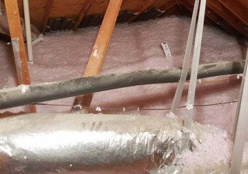
Most of those leaks hide in the attic floor, around recessed lights, the attic hatch, plumbing and wiring holes, dropped soffits, and flue chases. Insulation slows heat but lets air pass right through, which is why ENERGY STAR treats dark, dirty patches of insulation as a sign that air is moving through your ceiling.
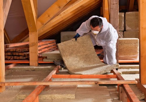
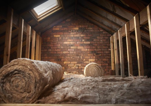
Once fire season winds down, I’d grab a flashlight, climb into the attic, and look for those gray streaks. Seal the gaps with foam or caulk, lay the insulation back over them, and consider attic insulation installation where coverage is thin or uneven so you’ve cut the stack effect pull that brings smoke indoors. If you have gas appliances, ask a technician to check their venting once you finish.
“After smoke season, I pull back the insulation along the top plates and around recessed lights, and the gray streaks show me exactly where the house was breathing outdoor air. Those same gaps are where the stack effect pulls smoke inside every time the outdoor AQI climbs.”
7 Essential Resources
1. Live Oregon Wildfire and Smoke Map: Current fire, smoke, and air quality layers for Oregon, plus steps for smoky days.
2. Using AirNow During Wildfires: What the Fire and Smoke Map shows, and why the AirNow dial sometimes tells a different story.
3. Oregon DEQ Air Pollution Advisories: Active advisories, text and email alert signup, and DEQ’s smoke-day guidance.
4. NOAA Hazard Mapping System Fire and Smoke Product: How NOAA produces and times its satellite fire points and smoke plumes, and where they fall short.
5. Technical Approaches for Sensor Data on the AirNow Fire and Smoke Map: How EPA corrects low-cost sensor data before it appears on the map.
6. Oregon Smoke Information Blog Fire and Air Quality Map: Oregon’s multi-agency smoke map, including temporary monitors near active fires.
7. Air Sealing Attic Access: U.S. Department of Energy guidance on sealing attic openings to cut the stack effect.
3 Supporting Statistics
1. Oregon had a heavy fire year in 2024. The state logged 2,232 wildfires across 1,797,796 acres, and the Northwest Area burned more acreage than any other region in the country. Source: National Interagency Coordination Center
2. Smoke now shapes western air quality. In recent years, wildfires produced up to half of all PM2.5 in some western regions, up from under 20% a decade earlier. Source: Proceedings of the National Academy of Sciences
3. Small leaks add up. Combined, the gaps in a typical home’s envelope equal a window left open every day of the year, and 9 out of 10 U.S. homes don’t have enough insulation. Source: ENERGY STAR
These statistics show how wildfire smoke, fine-particle pollution, and air leaks can all affect indoor air quality, making a well-sealed home and high quality filters important parts of preparing for Oregon smoke season.
Final Thoughts and Opinion
I think people give up on the smoke map because they expect one picture instead of several. I lean on the AQI reading for today’s decisions, treat the plume as a heads-up about tomorrow, and use the fire icons for context. Once you stop asking a satellite plume to tell you what you’re breathing, most of the contradictions disappear.
I’d also argue the most overlooked smoke defense sits right above your ceiling. A tightly sealed attic floor means less smoke is pulled indoors every time the numbers climb, while pleated furnace filters can help capture fine particles that still make their way inside, and the best time to do it is before next fire season.
Frequently Asked Questions
Is the AirNow Map or the OregonAIR App More Accurate?
Both pull from regulatory monitors. The AirNow Fire and Smoke Map layers in corrected sensor data for neighborhood detail, while OregonAIR focuses on Oregon DEQ monitors and official advisories. I use AirNow for what’s happening near home and DEQ to confirm whether an advisory is in effect.
How Often Does the Oregon Smoke Map Update?
Ground readings refresh throughout the day. NOAA updates its smoke plumes about twice during daylight hours, and satellite fire detections can run one to three hours behind real time because analysts review them before publishing.
Can I Trust PurpleAir Readings in Oregon?
On the AirNow Fire and Smoke Map, you can give them far more weight than raw numbers. EPA cleans and corrects that sensor data so it lines up much more closely with official monitors. Raw readings you find elsewhere skip that step, so use them as a rough guide.
Does Attic Insulation Keep Wildfire Smoke Out?
Not by itself. Insulation slows heat but lets air move right through it. Sealing the gaps in the attic floor first, then laying insulation back over them, is what cuts the air leakage that carries smoke inside.
What AQI Level Means I Should Stay Indoors?
Sensitive groups should limit time outdoors once the AQI passes 100, the Unhealthy for Sensitive Groups range. Above 150, the air counts as unhealthy for everyone, and most people should scale back outdoor activity, while top air filters can help reduce fine particles indoors during smoky conditions.
Read the Smoke Map With Confidence
Reading the Oregon smoke map layer by layer turns AQI readings, fire icons, and smoke plumes into one clear plan for your household’s day. Open the map, start with the reading closest to home, and let the other layers show you what to get ready for next, including when effective air filtration may help keep indoor air cleaner.